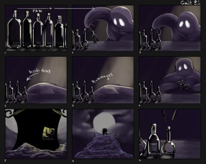
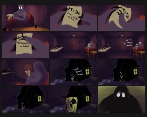
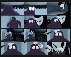
Progress has been slower than I’d prefer. I’m getting mired down in concept and every time I get an idea I have to come to a full stop and decide on what using it would mean for the piece. I think I need to care a little less; this is starting to feel all too familiar.
Anyway, in these storyboard panels you can see where the color scheme shifts dramatically to represent a change in atmosphere. At this point, I have an “intermediate” shot between the two major color schemes that have been laid out so far. The shot, a wide shot of the character walking through an outdoors environment, rests somewhat ambiguously between the warms from the interior of the character’s home and the cools from the cultists’ lair. The colors are similar to those of the opening shots, so they aren’t just coming out of nowhere.
All the panels are drawn at 1920×1080 because I’m trying to cut down on total work time by actually developing the backgrounds and animation as I work on them. (In order to accomplish this, the .psd files are robust, to say the least.) This means that when I string them together to create my animatic, it should read pretty well. From there I’ll be able to dive right into doing the in-between frames. I’m finding the painterly style to be fairly easy to replicate over a span of many drawings, so I’m confident that I’ll be able to maintain it for the final animation. The final image of the post is an animated .gif outlining my process of constructing each panel in order to show how the layers are broken apart.
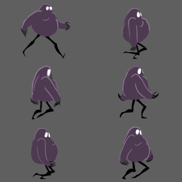
I tried a bit of experimentation with the main character’s walk. What I have here is something I did wrong, which taught me what not to do. I wanted to see how the walk would look if I put the down on the passing position and the up on the contact. As it is, it’s not working very well because the character looks way too jaunty. I think I’m going to have to dial that down by limiting his motion; in the walk cycle that’ll mean much shorter steps, less of a difference between the down and the up heights, and probably a little less arm swing to boot. In terms of other animation, it means less is more. In contrast, I’m putting a lot of focus into making sure the masked cult leader has a range of silhouettes that accentuate motion. The spiral hat/hair/thing sticking out of the top of his head proves to be an interesting challenge here, since I’m trying to avoid having it overlap with any other features in order to maintain that readability.
My character designs are no longer the same as they were when I first began conceptualizing them, but they’re still consistent throughout the storyboards I’ve done thus far.
There’s one more major color scheme I’ll be introducing once the main character is “indoctrinated,” then one final shift after that as the character makes its way back into its home at the end.
Egregiously, I haven’t had the opportunity to scan the storyboard panel thumbnails I’ve sketched. I’ll add those panels to this post as soon as I’m able.
I’m considering scrapping the whole “trippy room warping” effect I have going on in some of the early panels, because it doesn’t make too much sense with the direction I’m taking the concept.


Smart move making the storyboards actually usable for the animation. Some might need to be cleaned up first though before you use them.
Like we were saying in class, make sure your walk cycle is more cautious and less confident, since your character is more shy/nervous. Also, from the way you were explaining it, it seems like an awfully big project to complete in the amount of time we have left.
I’ve seen you accomplish some impressive things under a time crunch so as long as you keep pushing forward I can see you being able to get this done with some extra overnighters, we’ll make lots of coffee! Your lighting makes the piece so visually beautiful and the simplicity of the characters allows you to get some great motion. Your “what not to do” walk cycle could still be used as something silly to toss into the credits so there’s that.
I’m really excited to see how your project turns out. I love the shot in particular where your character looks at the invitation and then walks over to retrieve it.
The shot that closely follows where he peers at the door handle is a bit confusing, as I am not sure where he is in relation to the door. In the shot before he still seems as though he would have to take a step forward to grab the handle, but it seems like he has Mr. Fantastic’s capability of stretchy appendages.
Your art work is so unique and the story seems strong right before the ending. The ending seems like if you are trying to say to many things at once and ends up making the beginning weak because it doesn’t make sense.